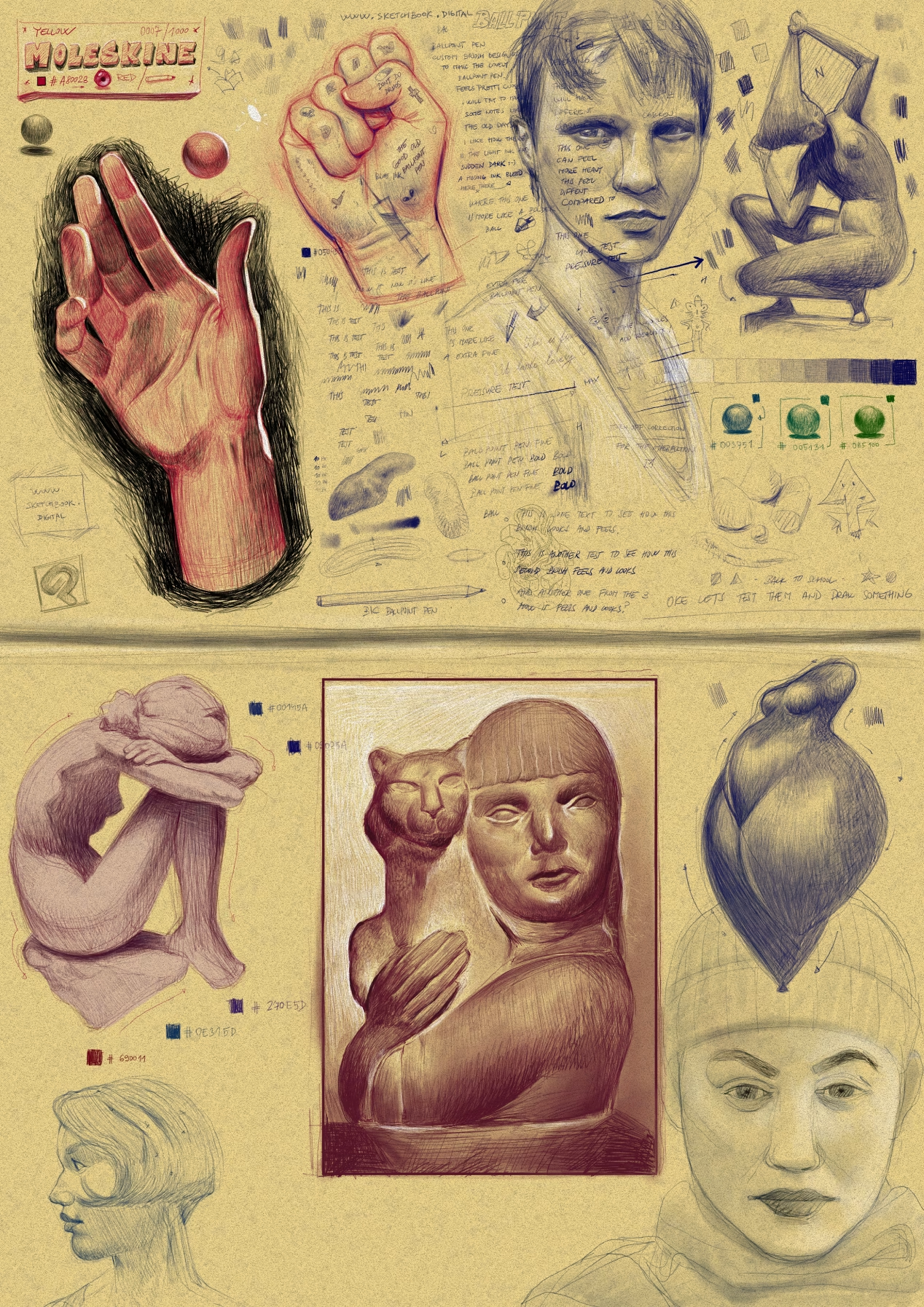
Sketchbook page with Moleskine and Digital Ballpoint pen Vibes.
There’s just something about the look of a ballpoint pen on Moleskine paper. It’s a classic combo that I’ve always found really inspiring, so I decided to try and recreate that specific feel in my digital work.
Building the Brush
I didn't actually have any ballpoint brushes on hand, so I spent some time messing around with the brush system in Clip Studio Paint. It’s honestly a powerhouse for this kind of thing.
At the top of the page, you can see where I was just "stress-testing" my strokes. I was really aiming for that specific ballpoint blue—that slightly oily, deep color. I even used the handwriting as a test; I wanted to see if the text actually felt like it was being written with a physical pen.
Testing the Limits
Once the pen felt right under my hand, I started playing with other colors and some light shading. I needed to see how the "ink" would layer and if the rendering felt natural when I started building up the shadows.
References and Flow
After I was happy with how the brush handled, I jumped onto Pinterest to find some references. From there, I just let myself have fun with it.
Mixing it up: I drew a bunch of different subjects to see how the pen felt across various shapes.
Light and Shadow: I spent time experimenting with how the pen renders light, focusing on getting those traditional-looking shadows.
In the end, it was just a great session of experimenting and playing around with light and shadow while using references. It’s satisfying when a digital tool finally clicks and starts feeling like the real thing.
Something very interesting happened when I tried mixing different hues of the ballpoint brushes into the drawing. It created these really cool color variations that I wasn't expecting, and it's definitely something I want to come back to and explore more in the future.